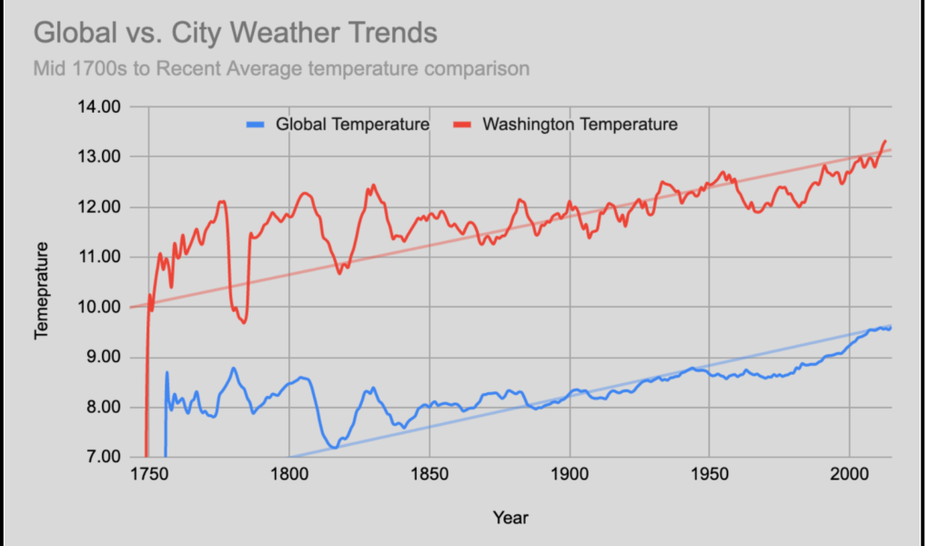
Weather trends using moving average and SQL queries
SQL Query:
Select * from global_data
Select * from city_data
The tool used to create line chart and calculations: Google Sheet
For city data, delete city and country columns as they were repeated and there was only one city and country before calculating the moving average.
Moving Average (MA) was calculated based on a 7 years average.
Formula used:
For global data =average (B9:B15) and that same formula was extended to next cell like B10:B16…B268:B274
For City data = B2:B8….B266:B272
Key Considerations:
Year should go on the X-axis and the value of average temperature should be displayed on the Y-axis.
Select Min and Max values based on the global and city data average of MA to display it nicely on the line chart to lessen the flat curve and show more variations for the comparison and trend study purpose to compare global and city-data.
Add a trendline to understand the increase in temperature and if that in parallel for both global and city curves.
For user experience, assigning meaningful titles, labels, colors, and legend locations.
Observations:
The overall average for global data and Washington city temperatures are showing similar trends in the rise of average temperature.
The rise of temperature is constant when you study the trendline for global and Washington City temperatures. The world is getting hotter.
Global temperature is overall cooler than Washington’s temperature.
Global Temperature
Min = 3.15 (Year – 1779)
Max = 14.19 (Year – 2015)
Washington City Temperature
Min = 5.45 (Year – 1752)
Max = 14.19 (Year – 2013)
1950 to 2000, global temperature had a consistent drop which started rising again.
Minimum of global and city temperatures were recorded in mid to late 1700 and maximum recorded in recent years.